Thursday 19 April 2012

CASE STUDY 12- Wikipedia's Blackout


Wikipdeia blocked out its English language encyclopedia for 24 hours in protest to SOPA and this infographic illustrates the impact of 'A world without wikipedia'. Overall this infographic doesn't appeal to me much as it has far too much writing and information for my liking, but i suppose due to the nature of the subject a great deal of text is needed to fully explain its facts and figures so that the reader/viewer is able to understand properly.

The aspects i do like from this infographic is the combination between colour scheme and the illustrations. First of all the illustrations/symbols are very simple but have bold line which doesn't over complicate things, this allows them to fully illustrate the subject matter. Accompanied with the teal colouring creating a killer contrasting combination on the light grey background. If there is one fault with the colour scheme it would be the difficulty i had reading the samll dark grey font and the grey background.

The infographic above combined with the previous 2 have inspired me to experiment and sample with symbols and illustrations to represent different subjects/sections for ones final infographic.


CASE STUDY 11- Objects ingested or inserted


The infographic above was created as a novel way to illustrate various odd embarrassing objects that have either been digested or inserted and been discovered via x-ray. I really enjoy the humorous subject that is then enhanced by the simple illustrations that aid in imagining the awful embarrassing situations. 

The colour combinations work well together due to the basic style of the inforgraphic and fonts used, It has very clean crisp lines which is key for readability on a black background.


CASE STUDY 10- Disegno industriale III


 This infographic was created by Alessia Agostini, Nadia Ceruti and Stefania Capellupo to "Present the course of Industrial Design in visual communication, currently held at the Politecnico di TorinoThe layout, pictograms and infographics were created specifically to communicate the values ​​and content of the course to new students". This infographic isn't like any others i have previously looked at, it isn't displaying mass amounts of information on one page but instead each piece of information has been neatly displayed on a separate page. The style of the infographic is very simplistic and minimal using only black and white, the main feature of the inforgraphic is conveying information through the symbols/illustrations.

I love the idea of using the symbols to put across information, even though the text above the symbols is in Italian i still have a general understanding of what each section is about due to the unersal language of images. I hope to incoporate something similar into mine after further research, sampling and development.

(source)

CASE STUDY 9- That's ADV baby!


"That 'ADV, baby! is a new digital project.


So new that has not yet been born.
Yet we have very clear ideas about his mission: to be a space where you will laughadvertising.
Of course also welcome those who take it seriouslybut only in derision.
How long before the first cry? Soonsoon.
This is the site of self-promotion campaign: now you see it published here, but soon you will receive it by e-mail. And then you'll know That's ADV, baby! has seen the light."


This is an infographic created by Fabrizio Tarussio to assist in self promotion called 'That's ADV baby'. This infographic is very different compared to all my other posts because it has been made using a more hands on approach instead of being digitally created. They've made the charts using paper nets, photographed them and then layered the information on top of the images using digital software. It's a very unique approach to infographics and has opened my eyes to sampling in ways other than digitally. 


CASE STUDY 8- Studio Muti, wordpress


Studio Muti from a survey by WooThemes to find out what designers and developers want from WordPress, they used their findings from over 2000 users to create this infographic. I find this infographic aesthetically beautiful down to every minute detail. The way the figures are conveyed through a variety of different styled bar and pie charts makes boring information visually attractive. This infographic is the best inspiration i have come across for pie charts and bar charts as the majority of infographics i have researched previously have mainly contained illustrations and used those to convey information. I love every single feature of this infographic, the dull simple colour scheme, the choice of font and point size, the layout, the illustrations, not using black outlines that would have cheapened the piece, the banners, the variety of methods to convey information... This is by far the easiest to understand and the most aesthetically pleasing infographic i have come across during my research.


Wednesday 18 April 2012

CASE STUDY 7- Forensic Science not guilty


Forensic Science created this infographic to inform about "The tragedy of wrongful conviction in the US and the DNA evidence that frees them". This infographic has a couple of key features that really appeal to me, one of them being the DNA strand that features down the centre for the majority of the infographic. It's good how they've made the DNA strand in to some form of link/path to key parts of information and how well it fits due to its relationship with the subject.

Another key inspiration for me is the colour scheme, the way the designer has successfully used a dark black background accompanied with contrasting bold white illustrations and text. I believe its success is down to the clean simple lines of the text and illustrations but also the small bursts of red mean the infographic doesn't become too much of a bore and attracts attention to parts meaning no key information is missed out.

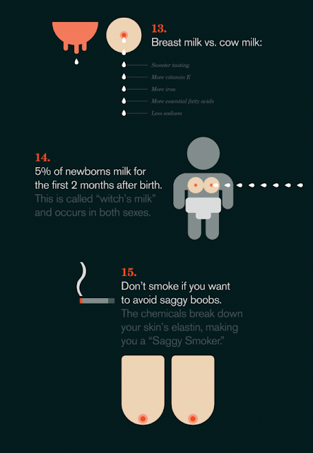
CASE STUDY 6- 15 things you should know about breasts


This infographic was created by Online Schools to illustrate some quite interesting facts about breasts as well as the costs and dangers. The infographic seems to be less serious than others maybe because it's not putting across an argument or because of the novel illustrations of the perfectly round uniform breasts. The colour scheme works really well and attracts more attention to the breasts due the dark background and grey illustrations of people. However, the small grey writing underneath some images is very difficult to read because of the combination of dark grey colouring as well as the font choice, i believe a cleaner font like Helvetica would have worked better.

Tuesday 17 April 2012

CASE STUDY 5- Bikes can save us!


This is an infographic created by Healthcare Management Degree to show the advantages and convert commuters into using a bike as opposed to a car. It provides a convincing argument due to the detail and attention used in the graphs, charts and illustrations. The illustrations aren't too elaborate but have their own quirky, distinct style that when partnered with the bold colour scheme instantly catch your attention and draws you in. I believe the typeface used has worked very well, it directs your eyes to all the key information and features due to its clean tall bold lines and legibility. 

CASE STUDY 4- XRay Technician School Free your feet


This is an infographic created by XRay Technician Schools to illustrate the effects of wearing running trainers and the benefits of running bare foot, it proves it point very successfully from the price benefits to health effects. Its a very clean example of an infographic and some what resembles an elongated magazine page due to its plain white background, a more formal layout and more detailed illustrations.
I'm not overly keen on the layout and features compared to others, i prefer a more simplistic illustration similar to case study 3 and a more random layout as opposed to the grid like layout used in this.


CASE STUDY 3- TSA grope and pillage


Above is an infographic from Online Criminal Justice Degree "laying out the incredible waste, incompetence and invasiveness of the TSA" This is one of my favourite infographics i have come across whilst undetaking research. The infographic has its own distinct unique style that sets it apart from all the others  every single feature stands out and grabs my attention; from the bold contrasting red illustrations, down to the simple banners used to convey the information. 


(sauce)

CASE STUDY 2- Lauren Binning work infographic


This infographic was created by Lauren Binning to guide and assist people who are confused as which career path to follow, it provides information such as; growing and declining occupations, satisfying jobs and employment rate based on education. What would be a boring article in a newspaper or magazine has been made visually exciting with the use of colour and organising the text and images in organised chaos. The use of multiple question marks and zig zagging paths/arrows further emphasises the infographics purpose to assist in careers paths. I particularly enjoy how Lauren has used ribbon/banner shaped boxes to illustrate the rise and decline of occupations, also the use of colour further represents these facts.


(Source)

CASE STUDY 1- A history of western typefaces


"The infographic above presents a history of typefaces, incorporating fun tidbits from tech, pop culture and the web" It was created by the team over at Mashable. The infographic uses a simple, subtle colour scheme with contrasting red splashes to put emphasis on the key components that are mentioned in the text. The way the timeline is presented reminds me of a ruler with its tall slender layout and the yearly indentations representing the cm markings, the dotted lines subtly direct your eyes to the key features of the design. Overall they have taken a piece of information that wouldn't normally be interesting and made it very attractive and intriguing.

(Source)