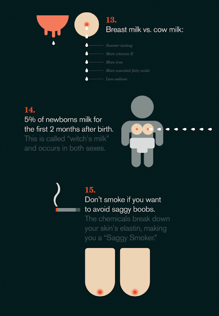
This infographic was created by Online Schools to illustrate some quite interesting facts about breasts as well as the costs and dangers. The infographic seems to be less serious than others maybe because it's not putting across an argument or because of the novel illustrations of the perfectly round uniform breasts. The colour scheme works really well and attracts more attention to the breasts due the dark background and grey illustrations of people. However, the small grey writing underneath some images is very difficult to read because of the combination of dark grey colouring as well as the font choice, i believe a cleaner font like Helvetica would have worked better.
(source)


